Graphics Projects
This is where I'll display some of my little personal graphics related projects that I've worked on over the years.
Great America's Height Signs
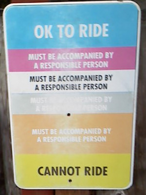
The height signs at California's Great America over the last few years have used a color coded system that was somewhat useful in figuring out if your child was tall enough to ride but only if you understood them.
Each color corresponded to a particular height range and children were given colored wristbands for the range they fit in. The idea being that you just have to match the wristband color to the sign.
Problem is many children didn’t get wristbands because at most rides the operators didn’t have time to measure everyone and hand them out, so nobody knew what these colors were referring to.
Also many of the rides that had a simpler sign that just said "Can Ride/Cannot Ride" would be in two nonsensical colors for example.
Red background for OK to Ride
Blue background for Cannot Ride.
Worse are cases like the Loggers Run sign below which I think is just a multicolored mess.
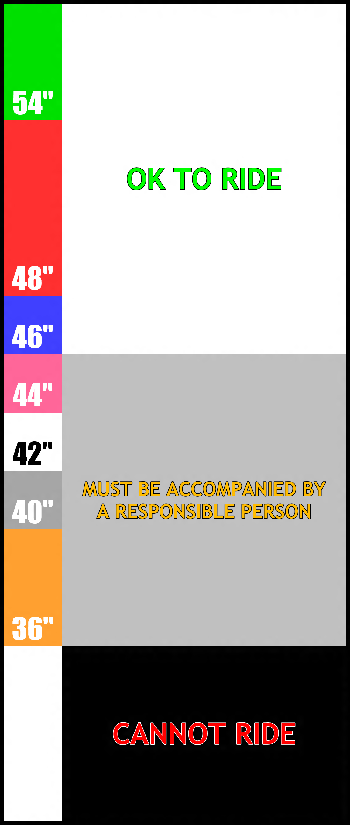
My goals in my redesign were to make it more obvious what the color coding was referring to and to give the signs a more consistent look.
All signs would have the full color code along the left side on them going from 36” to 54” which would look very similar to the height sticks that the employees used to measure children’s height.
The rest of the sign would have consistent coloring.
Green text/White background = OK to Ride
Red Text/Black background = Cannot Ride
Orange Text/Gray background = possible restrictions
Below is my version of the Loggers Run height sign.
Click image to view full size
I designed my height signs in html because I found it easier to work with them at their actual size which is about one foot wide by several feet tall. Paint Shop Pro simply couldn't deal with images that big. I also found it much quicker to try out different sizes/colors for text and other elements.
I made several example height signs in html to illustrate different situations.
Please note that the way I did the outlines around some text currently only works in Internet Explorer 10.
Simple Can Ride/Cannot Ride sign for the following heights
36" 40" 42" 44" 46" 48"
and 54"
Endeavor shows how a sign with a maximum ride height would look
Loggers Run shows a sign with a conditional restriction
Pixie & Dixie's Swing Set shows a sign with a maximum height conditional restriction
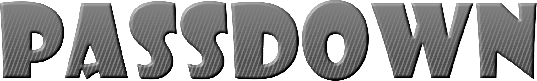
Passdown Image
I created this image to be used as the header on the passdown sheet that we would use at Great America to write down our daily passdown in the morning. Previously we were using a badly photocopied hand drawn image for our passdown sheet. That image was actually a poor imitation of a better hand drawn image that was used a few years before. I'm not entirely sure but I believe that original image was drawn back in 2002 by my best friend John. The font and overall style I used were loosely based off of that original hand drawn image.
Click the image for full size image, or download the MS Word doc file Passdown.doc
Mouse Cursors
I created these cursors a while back because I felt the default windows cursors were a bit small and and bland looking.
These cursors are just modified versions of the "Windows Standard (Large)" and "Windows Animated" cursors that come with windows.
Windows Default Cursors |
||||||||
The Other Windows Cursors That I Modified To Create My Cursors |
||||||||
Patrick's Animated Cursors - Standard Download |
||||||||
Patrick's Animated Cursors - Purple Download |
||||||||
Windows Vista/7 come with new cursors that I prefer over the ones here. I am currently using the "Windows Aero (large)" set.
Stop Drop and Roll
My inspiration for this came many years ago at a rave. One of my friends just proclaimed "Stop! Drop! And Roll!" while miming the steps. for some reason it just stuck with me. I always thought it would be funny to make something parodying one of those fire safety things.
This is my final version. You can see my first attempt in animated GIF form here

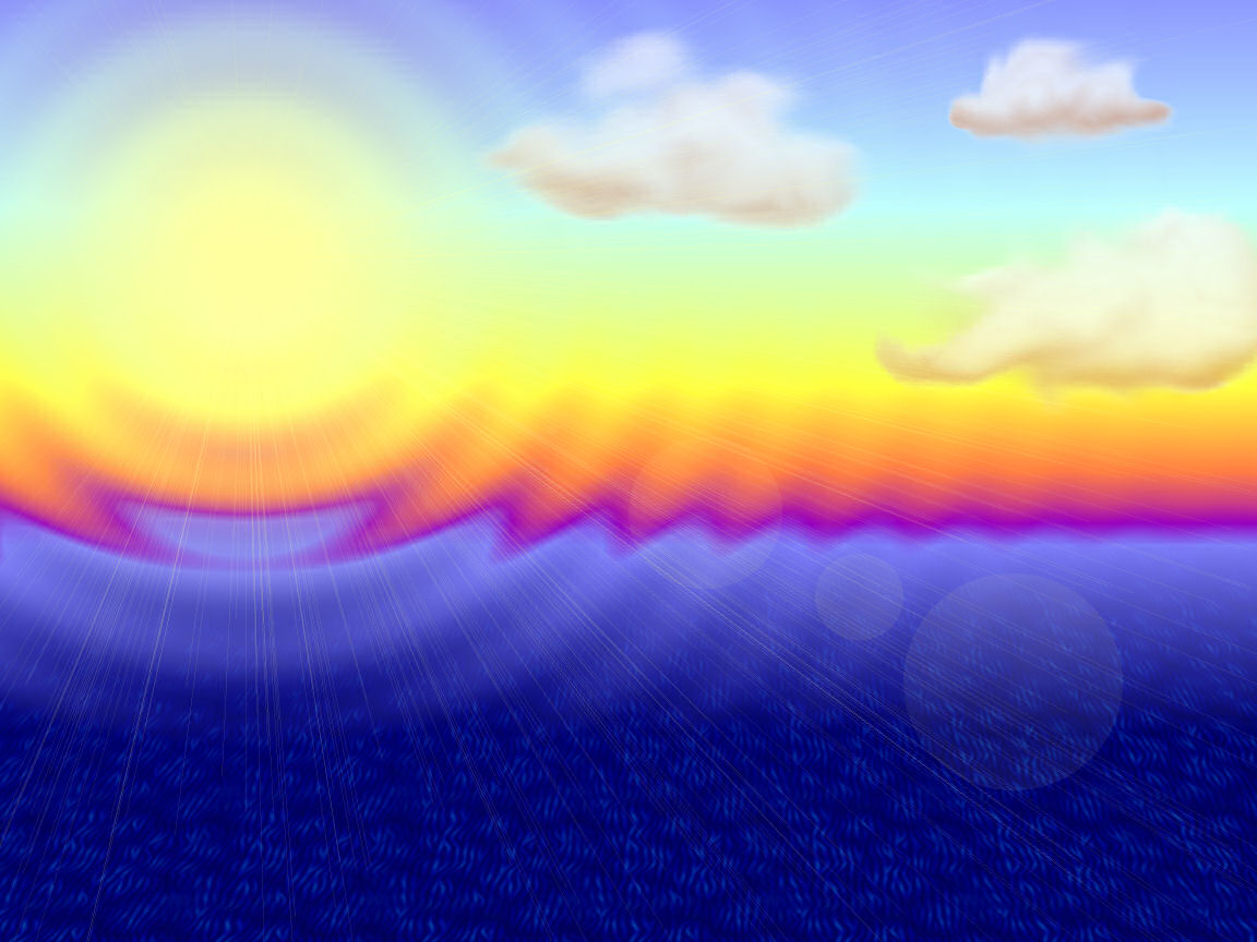
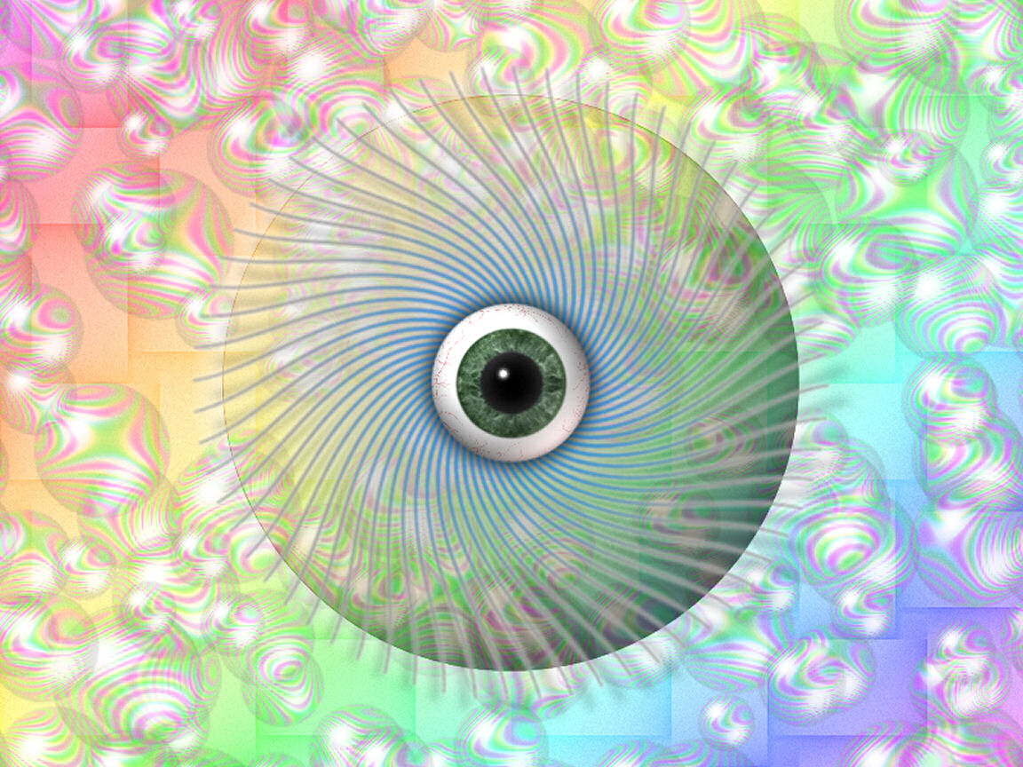
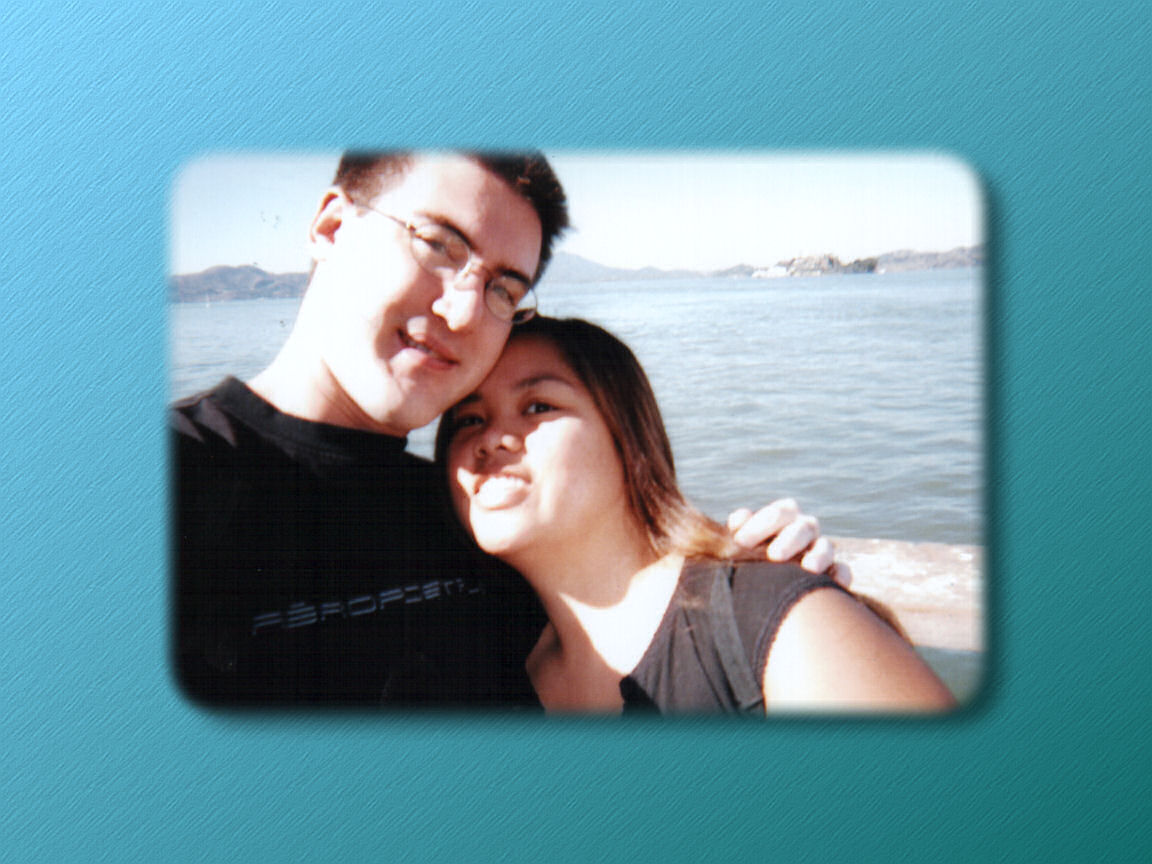
Desktop Wallpapers
Here are some of the better wallpapers that I've made, they were mostly the result of just messing around in Paint Shop Pro.
Click images to open full size image
WindowBlinds Skins
WindowBlinds is a program that allows you to change the appearance of Microsoft Windows, check out the web page here www.stardock.com/products/windowblinds
Way back around 1999 I found out about WindowBlinds and started using it. I soon decided to make my own skin. Overall it was fairly simple but mostly complete for the version of WindowBlinds that was available at the time (2.0).
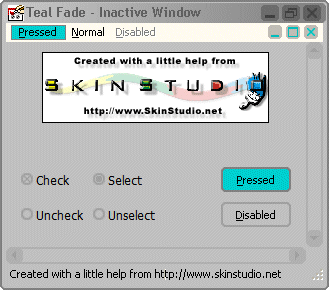
Please note that the skin studio screenshots don't show the skins exactly the way that it should look. Mainly the menu bar buttons and the title bar in the Teal Fade 2 screen shots.
So here is my first WindowBlinds skin that I called Teal Fade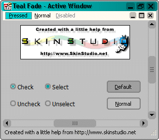
Click image to view full size
I then started to make a more visually interesting skin but I only got it about half done since I lost interest in using WindowBlinds at the time.
As you can see the scroll bars look the same as my first skin since I didn't get around to making
better looking ones.
This is my second WindowBlinds skin that I called Teal Fade 2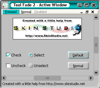

Click image to view full size
Random Stuff
Click image to view larger

Click image to view larger
My "Business" Card 2010
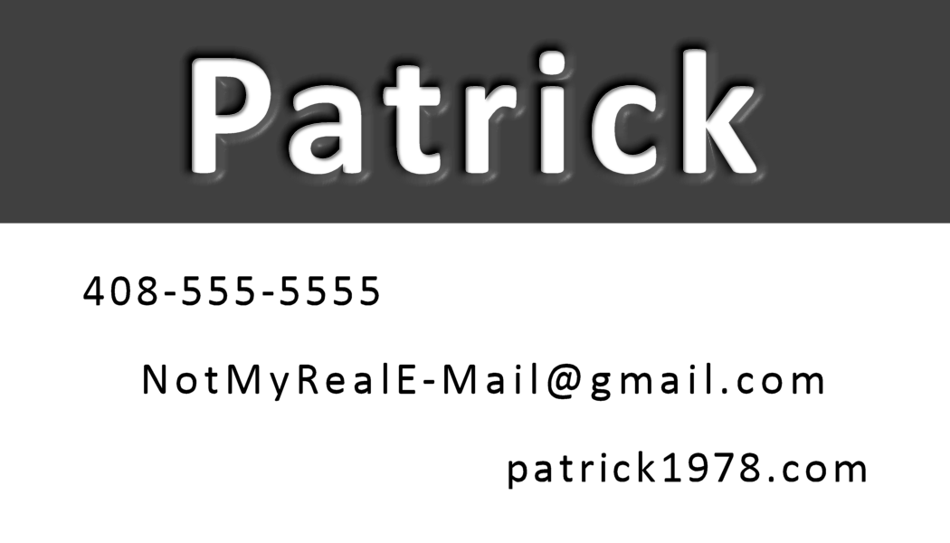
Click image to view larger
My "Business" Card 2006

Click image to view larger